Geometrics For The Guys

Are Cards for Guys Harder?

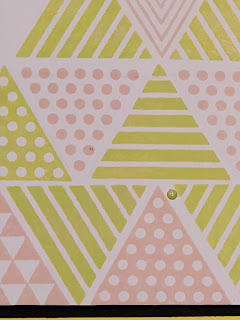
I'm moving outside of my comfort zone in focusing on cards specifically for guys and by making a card from stamps that are geometric or abstract. One of the tips in the Altenew's Cards For Guys class, suggested using gender-neutral stamps. This stamp by Altenew named Trigonometry looked to be about as gender-neutral as a stamp could get! 


I started by choosing a two-tone color palette of Altenew ink cubes in Limeade and Blush. Not having worked it out in my head and completely unsure of what my final design was going to look like, I selected one of the triangles in the stamp set and started inking it up! 


Using an A2 panel of white cardstock, I continued to add patterned triangles to the card, alternating between Blush and Limeade ink and the card started taking shape. Once I felt like I had a design going, I decided to just keep adding other triangles and mixing the patterns. 

I selected black cardstock and lime green cardstock for matting. I reduced the black A2 panel by 1/8 inch on each side, and adhered it to the green A2 panel. Next, I reduced the stamped panel by 1/4 inch on all sides and adhered it to the black panel. My last step was to stamp a sentiment from the stamp set at the top center in Memento Black Tuxedo ink, added lime green enamel dots and was finished..

 I would have to say designing a card specifically for a guy was not really any harder than making a card for a women., it's just as much fun and opens the door to more creative possibilities.



Comments

  1. Interesting color choice for a guy card! I am glad you didnt stop midway. Thank you for submitting your work to the AECP assignment gallery.

    ReplyDelete
    Replies
    1. Thanks Erum, yes, didn't think about the colors maybe not being the best choice for guys until I was finished!!

      Delete

Post a Comment

I would love to hear from all card makers.

Popular posts from this blog

Time Out Challenge #214

  The card that I decided to enter in the Time Out Challenge #214 definitely fit the criteria of being night themed.  The image of The Three WiseMen is apropos because Christ was born during at night. Who knew that this little baby born during the hours of darkness would become the Light of the World?  God knew.  Thank you to Kailash, whom I met on IG and gifted me several of these Tim Holtz Christmas die cuts last year. Little did she know how much The Three Wise Men means to me. 

A Simple Card that Shines

Heat Embossing & Big Florals This extra large Altenew floral stamp has been a long time favorite of mine and was among my first Altenew stamps. I chose to heat emboss this stamp in white to achieve some subtle shine and contrast against the cardstock. I feel it worked out nicely, although the photo doesn't show it very well. After selecting a beautiful coral-red cardstock, I cut it down to 5.5. by 4.25 and dusted it with anti-static powder. Using my MISTI stamp platform, I stamped the Altenew Bouquet of Love using Versamark ink onto the card panel. I stamped several times to get a good coating on the cardstock, which the MISTI makes it easy to do without mistakes.. Once, I was satisfied with the amount of ink on the cardstock, I sprinkled white embossing powder over the card panel, brushed off extra powder using a paintbrush and used a heat gun to seal the embossing powder to obtain a nice sheen.  I set that aside, and used a scalloped edged Gina Marie Designs die, and cut out

Stenciling without Stamping First

When I started on this card, I had a vague idea ruminating in my head, but I wasn't sure how to accomplish what I was thinking. It came to me during an Altenew AECP class entitled, Celebration Stencil Techniques, where I watched the instructor, Laurel Beard demonstrate several cool methods for using stencils in creative ways. I wanted to do likewise, so I decided to use the Altenew Magnolia Ballerina three-layer stencil without stamping the image first. I know, its not revolutionary or anything, lol, but I had seen a few cards that looked like they were colored that way because the look of the coloring was diffuse and I thought that would work well with ink blending. That was the plan...and it turned out exactly how I envisioned it. I was pleased with the results of using the stencil set in a non-traditional way. I blended Distress Oxide inks in Squeezed Lemonade, Carved Pumpkin and Candied Apple randomly on each of the three layers. Without the guidance of the stamp outline, I fel